Unit 32 Raising Aspirations
P1 Researched Events
For this unit of the project the aim is to redesign any logos, leaflets, flyers and web designs the event Raising Aspirations had and to make new ones. The purpose of this is to promote the event and to make it stand out more than the previous years the event has been on for.
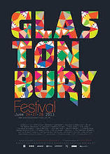
Glastonbury is a music festival. The purpose that Glastonbury has is to reach out to a audience that likes music and likes live music. The format that Glastonbury has to reach out and inform the audience is through posters and on websites. The styles that Glastonbury has is brightly coloured posters and on the actual event bright coloured stages and stands. The content that Glastonbury has is based on music. The content that Glastonbury brings is live music. The layout that Glastonbury has is that there is stages set around the area on the festival day with different types of music.
The purpose of this poster is to show/inform people of the target audience which is people who like music on what the event is and where it will be and what dates the event will be on and what type of music will be going on there.
The format that this poster has is that it is in a A4 size poster which can be an advertisement for the event which can be put on their own websites and social medias such as Facebook pages and twitter.
The content that this poster has is that it has a range of different bright colours on the name of the event which is the biggest part of the poster. The use of space that this poster has is that every part of text and image that this poster has is in the middle of the poster which is in the size of an a4 poster and the movement is still. The editing that this poster has is that there is different types of fonts on the poster and use of bright colours and a dark background to make it stand out.
The style that this poster has is in a calm and graceful style meaning that the colours is calm and graceful as well as the fonts is calm and graceful and it is quite slow because you don't get a feeling that the poster shouts out to you but instead it is calm and slow.
The layout that this poster is in is that it is split between different sections throughout the poster. For example the name of the event is big and bold with bright colours then below is the information of the event in smaller writing and a different use of colour but all of it is based in the middle of the poster then sponsors of the event is on the very bottom of the poster.
The target audience that this poster is going for is people who love music and want to be music artists or just generally people who love listening to music. This is because it is a must event with different genres of events.
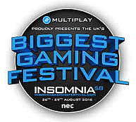
Insomnia is a gaming festival which has a purpose to target gamers that love games and like entertainment in games. The format that Insomnia gaming festival has is through social media and websites to reach out to the audience. The type of style that Insomnia has is with modern day technology with modern day consoles and gaming pc. For example a PS4 is a modern day console and big brands such as Razer come to gaming events to show off their gaming computers and computer equiptment. The content that Insomnia brings is a variety of games to an audience roughly between 12 and over and just generaly people who like games. The layout that Insomnia has is different sections and areas for different games and areas for special guests such as big youtubers and twitch streamers.
The purpose of this poster is to inform the target audience of gamers that love different genres of games.
The format that this poster is that it is mainly a standard sized logo with bright colours to stand out to the target audience and this logo can also be put on any other posters. It is in a style that it can be put on social media, so like an advertisement for their event and be put on websites and social medias like twitter and Facebook pages they have so they can let people know about the event and give prices and where the event will be.
The content that this poster shows is what the event is and how it is the "biggest gaming festival" known, also it shows what dates when the event is on as well as sponsors of the event is on the poster it also has bright bold colours on the logo which stands out, especially to the target audience of the event. The use of space in this logo is that it is in the middle as a whole logo and can be used in any space on any other posters for the event. The editing of this poster has is that it has different types of fonts which stand out to the person looking at the logo/poster and it has a dark background with use of bright colours to stand out.
The style that this poster has is that it is fairly big sized for a logo with a bold look including the text and the actual shape of the logo to stand out. It is also quite fast meaning that the logo almost shouts out to the person looking at it because it is big and bold.
The layout that this poster/logo has is that it it is all one big logo giving information about the event such as dates it is ran on and what types of sponsors are affiliated with the event.
The target audience that this poster has is a target audience of gamers and people of all ages that like games and people who want to meet big youtube stars such as syndicate who usually is there every event. because it is a gaming event with loads of gaming equipment and games to play.
Regulatory Bodies
Regulatory bodies is actions by public agencies/governments to help make content non offensive or to keep content age restricted. An example of regulatory bodies is the BBFC. The BBFC is a company that watch new movies and put a age restriction on them. The reason why they are regulatory bodies is because they put age restrictions on films so the wrong audience does not get offended as well as hearing words that shouldn't be heard. For example a 10 year old hearing swear words.

The Olympics is an event to do with sport and entertains people and has an aim to win different types of sport and compete against other countrys. The purpose is to target people who like sport and want to support their country. The format that the Olympics has is usually through social media and the news to target out the audience that loves sport and supporting their country. The style they have at the actual event is usually stadium areas for each different sport. The content that the Olympics brings is different types of sport to people who love watching sport and love supporting their country. The layout that the olympics has is that there are different areas for different sports to watch. every leap year there is a different country where the olympic stadiums are built.
The purpose of this poster is to inform people of the target audience which is people who love sports or people who want to support their country on where the event will be and what it is which is the olympics.
The format that this poster is in is that it is in a A4 size poster which can be used as a self advertisement for the event which can be used on social medias like Facebook pages and twitter as well as personal websites.
The content that this poster brings is that there is a range of bright colours used throughout the poster. The use of space that this poster has is that the logo and "olympics" text is based in the middle of the page along with the "Rio 2016" text in the middle as well and the rest of the picture on the outskirts of the page. The movement of this poster is fast due to the pictures of the different sports on the poster making it look active and fast. The editing of this poster has different use of bright colours throughout the page. For example the background is a light blue and the text is black so it stands out then the logo is different colours so it stands out as well. The pictures of the different sports is on the bottom of the poster and on the outskirts of the left and right o the poster.
The style that this poster has is in a fast and exciting type of style. The font of the text in this poster isn't as fast and exciting because it is just black text so the text is calm but the logo is exciting due to the bright colours and the poster general is fast because the pictures of different sports at the bottom has a fast look making the poster look fast and exciting.
The layout that this poster has is in different sections on the poster. The top half of the poster is the name of the event along with the logo of the event and on the bottom half of the page it shows which different types of sport will be on the event in the form of pictures as well as where the event will be taking place.
The target audience that this poster is going for is people who love watching sports in general and for people who want to support their country in sports because the whole event is to do with different countries competing with each other in sports. So the target audience is for people who love watching sports and for people who love supporting their country in sports especially or people who just want to support their country.
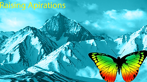
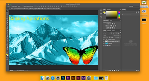
This is what I made in photoshop as one of the first ideas for a logo that I made for raising aspirations. below it shows how I did it. FIrstly I added a mountain as the main background to give it that calm look. After this I added a plain black box background and blended it in with the mountain background and changed the colour to a bright blue to make it stand out. Once this was done I added a picture of a butterfly and a text which said "Raising Aspirations" because thats the name of the company/brand.
P2 concept ideas, logos for Raising Aspirations


for the final idea for a logo I made for Raising Aspirations is a more simple logo that doesn't take alot of effort to look at and understand. The steps I did to make this logo is I added a simple background of a mountain shape digital drawing. After this I added one text on one mountain saying "Raising" and on the other mountain I added a text saying "Aspirations" to show what company/brand the logo is for then I added a butterfly on another mountain which is the smallest one.
This is the second logo I made as an idea for Raising Aspirations. This logo is more similar to the first logo I made, the only difference is that there is no added colour to the picture. For this logo I added a picture of a big rocky/mountain environment and added a butterfly and a text saying "Raising Aspirations"


P3 Client Presentation
Feedback for pitch
For my pitch I did a power point presentation on the 3 logos that I designed for Raising Aspriations and I talked about each logo. The person who I was presenting the presentation to was Tim Holmes. After I had finished the presentation I had got some feedback from Tim himself. The feedbackI got was that overall it was a good presentation and that I had a good understanding on where, what, why and who the logo can be for. The thing that I can improve up on is making more detailed logos.
Self Review
Overall my thoughts on how well I did in the pitch I made was good. The things I feel that was good was that I made 3 logos that were suitable to the target audience which was year9/13 year olds and above. The thing I feel I could improve up on is making more detailed logos and how I talk during a presentation
P4 My Edited Logos/ production plan

For this logo I changed the old text and blended it out with the sky background and added a little tint of orange to make it more detailed. I also changed the Raising Aspirations logo text sign to make it more interesting to get more attention from the audience.

For this logo I changed the mountain colour and changed the sky background to a lighter blue so that it will stand out better to the audience which is year 9 (13+ year olds).

For this logo it was the same as the other logo but I decided to change it to make it more brighter and more interesting because the other logo was a little dull so I changed it to make it brighter and make it stand out more to the audience of year 9 (13+ year olds) at the Raising Aspirations event.
Planning
The planning of the logo is to try and make a bright coloured theme/background and to have a symbol or a title on the logo to tell people who the logo is for. As part of the plan I wanted to make a logo that started at one stage of being a rough idea to a final stage where I put in all my ideas and thoughts to make a final logo that is the best out of all the logos made.
The launch date for the event will be 24th and the 25th of January so I would have to plan how and when the logos will be released for the event.
Legal/Ethical Issues

Budget
For these logos there is legal issues such as images from google used in these logos. The legal issues with all of my logos is that there is images from google which can lead to copyright claims. Copyright can be an issue because some of the pictures I used from google may be owned by people so I would have to buy the picture off them due to the Copyright Act. The types of ethical issues in my graphic design logos is that there may be people who think these logos may be playing stereotypes or religion or racial hatred so I must make sure there isn't anything playing any religions, stereotypes or even racial hatred in my logos, if i were to do this it may offend people which may affect the event and less people would end turning up.
As part of this project the money aide to things would be that I had to spend money on equipment such as buying an iMac and the software to help with my graphic design such as Adobe software Creative Cloud and time costs. The first stages of planning was the rough ideas for the logos. These were the first logos I made and took me roughly a day to come up with the ideas and make them in photoshop. The second stage of the planning was to come up with a presentation to present to Tim Holmes and it took me roughly 2-3 days to think and come up with a presentation fully finished to present to Tim. After presenting I got feedback from Tim so I took this feedback to make a second set of improved logos from the first set of rough logos that I showed to Tim. It took me roughly again a whole working day which is 6 hours to think and improve up on my logos I presented to Tim. As the final part I decided to make a brand new set of logos which was my final logos. This roughly took me about 2-3 days. The reason for this was because I was thinking of the feedback I got from Tim and how I could come up with a brand new logo that was good enough to be used and both fitted the feedback from Tim and fitted the purpose of Raising Aspirations.

P5 Final 3 logos for Raising Aspirations.
This is my first out of the 3 final logos I have designed for Raising Aspirations. For this logo I used a sunset picture and added a black background onto the sun and cut the background to the suns shape. After this I changed the colour to a bright green. In this logo there is the Raising Aspirations writing and the little logo I designed inside this logo that is in blue next to the butterfly. another thing that I did to this logo is that I added a text which said "Raising Aspirations" and it is in a custom font called Pricedown. This is fit for purpose because the client I have which is Tim Holmes wanted a calm type of logo as well as he wanted a butterfly in the logo. Another reason why this is fit for purpose is because the target audience is people who are in year 9 so they won't have a hard time understanding the logo and it sends a message to say aim high and raise to get your aspiration hence the butterfly flying up in this logo.


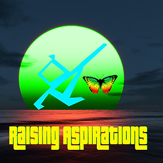
This is my second logo out of the 3 final logos for Raising Aspirations I designed in photoshop. For this logo I added a sky background as the main part of the logo. After this I added the little word symbol/logo I designed in photoshop. I duplicated this symbol to give it a 3D affect, one symbol is blue and the other is black for the 3D affect. After this I added a black background to the sky and changed the filter to "colour" to make it grey at first then I added a blue/purple tint to give it the colour it is now in the logo. After this I added a custom font saying "Raising Aspirations" and the font was called "Policata". This is fit for purpose because our client Tim Holmes wanted to have a calm background like the old logo he had which had a picture of the sky. It is also fit for purpose because the target audience of the event is the age of year 9 in secondary school won't have a hard time to understand the meaning of the logo and it sends a message to say aim high and achieve your aspirations hence why the logo is in the sky.


For this logo out of the final 3 logos this is the last one I designed in photoshop for Raising aspirations. In this logo I added a picture of a beach with a sea aswell. Once I got this photo up on photoshop I added a picture which was a black background and used the lasso tool to go around the sea near to the beach. Once I did this I copied the cut from the lasso tool and pasted it and set the layer to colour. Once this happened the sea went grey so I used the bucket tool to change it from grey to light blue. After I had done this I added my little logo/simble that is an R and an A put together into the photo then i duplicated it and made one symbol black and the other blue to give it a 3D affect. Once I had done this I added a butterfly that was brightly coloured so that it sticks out better to the target audience at Raising Aspirations which is year 9 (13+ year olds). Finally I added a title saying "Raising Aspirations" in a custom font which is called "Rakoon" to let people know who the logo is for. This is fit for purpose because Tim Holmes which is our client wanted us to make it similar to the old logo that Raising Aspirations had and he wanted to still have the idea of a butterfly in as well as a calm background. Another reason why it is fit for purpose is because the target audience of the event is in year 9 so they will find it easy to understand the logo and it tells a message to aim high and make sure to achieve your aspirations which is why the "raising Aspirations" part of the logo is high.

Existing Work

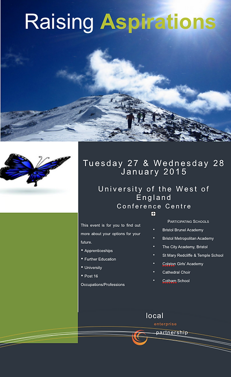
This is one of the background designs/logos that Raising aspirations had before. One thing that I changed between this picture and the picture I made for Raising Aspirations is the colour scheme. On the picture/logo I made I put in some brighter colours but still had a calm looking background like the original picture because both pictures are both calm looking backgrounds.
This is another logo/leaflet that Raising Aspirations originally made. The difference between my logo and the original is that the logo I made had a signature to show it is raising aspirations. The things that I wanted to keep the same was the "Raising Aspirations" title to show it is Raising Aspirations and that the backgrounds of the logo/leaflet is high meaning that the people of the target audience should aim high and to raise their aspirations.